Using Shruti Font for Better Gujarati UI and Graphic Design
Typography is one of the most powerful parts of visual communication, especially when designing for regional languages like Gujarati. A design can have beautiful colors, clean spacing, and strong imagery, but if the font does not support readability, cultural familiarity, and proper character rendering, the final result can feel incomplete.
Selecting the best font is not only a design choice for graphic designers, UI designers, web designers, and branding professionals, but it is also a language decision for them. It has a direct impact on user experience, accessibility, trust, and overall design quality.
Shruti Font is a commonly used font in the Gujarati language in the digital world, in documents, websites, design projects, etc. It is commonly used for clean Gujarati text rendering and ease of use, and is helpful for designers who require a consistent font for use in Gujarati communication.
For designers who are just starting to work with Gujarati typography, it is important to first understand how the font behaves in real design situations. Before using it in a professional project, you should test the font in different sizes, weights, layouts, and backgrounds. Many designers look for a proper font Shruti download source so they can install it, test it inside tools like Photoshop, Illustrator, Figma, Canva, or web design software, and evaluate how it performs across different design formats.
Why Gujarati Typography Needs Special Attention
Creating designs using Gujarati characters is not the same as creating designs using English or Latin characters. The rhythm, character proportions, curves, and visual density of Gujarati script are unique. Simple designs that work well with English text may not necessarily adapt well to Gujarati text. That is why it’s important that the graphic designer carefully adjust the spacing, font size, line height, and alignment when using Gujarati typography.
The biggest error that designers can make is considering the regional language text as a replacement for English text. They design a layout in English and then add the Gujarati content without altering the structure of the layout. This frequently results in limited space for text, disrupted visual harmony, or readability issues. Words from the Gujarati language may require a little more or a little less spacing and line height to fit comfortably on screen or page. However, Shruti Font can facilitate this process as it is easy to handle and looks familiar as well.
For instance, if you are developing a mobile app in Gujarati, then the size of the buttons should not be very small. There ought to be sufficient space for Gujarati characters so that they are not blurry. Very tight linespacing and narrow containers for Gujarati text may result in an interface that is hard to read. In the same way, if you write a poster or a flyer in Gujarati, the headings should be tested from a distance to ensure that they can be read.
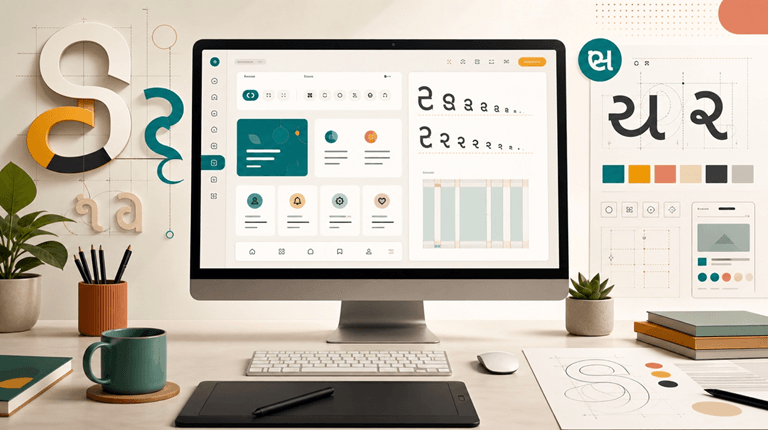
Shruti Font in UI Design
The key elements of UI design are clarity, speed, and usability. Labels, menus, instructions, and messages should be understandable to users. If the font is used in an app or website, it should be able to facilitate rapid reading in Gujarati. Shruti Font is a suitable font for interface text due to its simple and functional design, which does not draw attention to itself.
In UI design, Shruti Font can be used for navigation labels, form fields, buttons, onboarding screens, dashboard text, notification messages, and content sections. However, designers should avoid using very small font sizes. A font may look fine in a large heading, but it can become difficult to read in small UI elements. Always test the font at real screen sizes before finalizing a design.
Another important point is contrast. The Gujarati font should have a strong contrast against the background. The combination of light gray Gujarati text on a white background can be stylish, but it can make text hard to read. Readability is more important than decoration on the UI in the case of an application with a wide user base. Clean background, proper spacing, and strong color contrast are where Shruti Font shines.
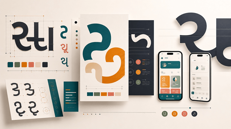
Shruti Font in Graphic Design
Graphic design offers more freedom of creativity than UI design, but there has to be a level of readability. The Shruti Font can be used for posters, banners, social media graphics, brochures, business cards, packaging, educational material, and advertisements. It is very helpful in designs where clear and concise information is important, as it is a clean Gujarati structure.
Social Media Designs can be used with Shruti Font in Quotes, Festival Posts, Announcements, Offers, and informative Carousels. Social media users tend to skim quickly, and the headline should be understood within seconds. However, if the text is too fancy or crowded, then users might not read through the post, which is written in Gujarati. If you’re looking to make the message pop without compromising the design, a clean font like Shruti can help.
Designers make sure to preview fonts for print design. Occasionally, fonts appear better on the computer screen than in print. If you have a brochure, flyer, or packaging design that you want printed, test the font before you send it in, and make sure that the Gujarati characters are printing correctly. If necessary for printing, be sure the font is embedded or outlined.
How to Use Shruti Font Effectively?
The ideal way to experiment with Shruti Font is to maintain a balanced and clean design. Avoid using so many font styles and other effects in the layout. With the current visual identity of Gujarati typography, introducing more shadows, strokes, gradients, and decorative elements can make it more difficult to read.
Also, alignment is key. Gujarati text can be used left- or center-aligned to suit the need for the design. Left justification tends to be a better option for longer paragraphs. Center alignment is suitable for short headlines, quotes, invitations, or text for posters, but it should not be used excessively for longer blocks of text.
Pairing Shruti Font With Other Fonts
The ability to pair fonts is a crucial aspect of any designer’s job for a bilingual project. English words, brand names, numbers, or technical terms are also included in many design projects of Gujarati. In this event, Shruti Font should be used in conjunction with an English font that is clean and compatible.
Avoid pairing Shruti Font with overly decorative English fonts unless the design is specifically festive or artistic. For professional UI, corporate graphics, educational content, and web layouts, pair it with simple sans-serif fonts. The English font should not overpower the Gujarati text. Both fonts should feel like they belong to the same design system.
For example, if your Gujarati text is clean and formal, use a modern sans-serif English font for supporting text. If your headline is in Gujarati, reserve the English text for a smaller size and secondary. This will help to establish a clearer visual order as well as guide users to read in the proper order.
Importance of Spacing and Hierarchy
The selection of a good font is not a solution to a poor layout. Spacing and hierarchy should be used correctly by designers. Hierarchy communicates to the viewer what is most important. Gujarati design can be achieved in a variety of ways, including font size, font weight, font spacing, color, and placement.
In a promotional banner, for instance, the first thing that is supposed to be the biggest ought to be the offer headline. The Gujarati text should be smaller, and the call-to-action should be clear. Too much consistency in text size makes the design unintelligible. While a Shruti font can help ensure a readable website, it’s important to make sure that there is a clear hierarchy of information.
White space is also a factor. Many designers attempt to use text, icons, or decorative shapes to fill in all blank spaces. This makes the design less strong. The Gujarati text requires space, particularly in the professional layout. The spacing of the design gives the impression of a premium, organized, and easy-to-understand design.
Shruti Font for Branding and Professional Communication
In the case of brands geared towards the Gujarati market, typography is a significant element of trust. If you have a brand image with a local, friendly, and professional vibe to it, a clean Gujarati font will help you with that. Shruti Font can be used for brand communication to convey information in a clear manner.
It can be utilised on business profiles, service brochures, local ads, educational websites, government communications, community campaigns, and digital marketing creatives. Consistency is a key concern when it comes to branding. For Gujarati communication, designers can be sure to use the Shruti font for all materials and maintain a consistent look to the material.
But for luxury, fashion, wedding, or more expressive design branding, designers can use Shruti Font with more expressiveness. The key is balance. The font choice should enhance the message rather than compete with the overall design.
Testing Shruti Font Before Final Use
Designers should try the Shruti Font in various situations prior to employing it in a final product. Make sample headings, body text, buttons, captions, and long paragraphs. Review the font in various formats (mobile, desktop, print, and social media). This testing process helps to prevent issues in the future.
See how numbers, punctuation, and English words line up with Gujarati text as well. In the real world, there are numbers in phones, prices, addresses, dates, and combinations of languages. These should all be managed well by a good design.
Before finalizing the complete design of the project, if it is on behalf of a client, it is a good idea to provide a sample layout to the client. There might be preferences for some clients depending on the kind of audience, industry, or brand personality of their clients. Early testing saves time and increases the chances of a good outcome.
Popular on OTW Right Now!


About The Author
Gagan Bhangu
Founder of otechworld.com and managing editor. He is a tech geek, web-developer, and blogger. He holds a master's degree in computer applications and making money online since 2015.