
Stop Drawing Box Plots by Hand — There’s a Free AI Tool for That
Three years into my statistics career, I still catch myself sketching box plots on scrap paper during meetings. The reason I didn’t want to is that the tools I had were slow or difficult.
Then I built an AI box plot tool that solved it. Here’s the story.
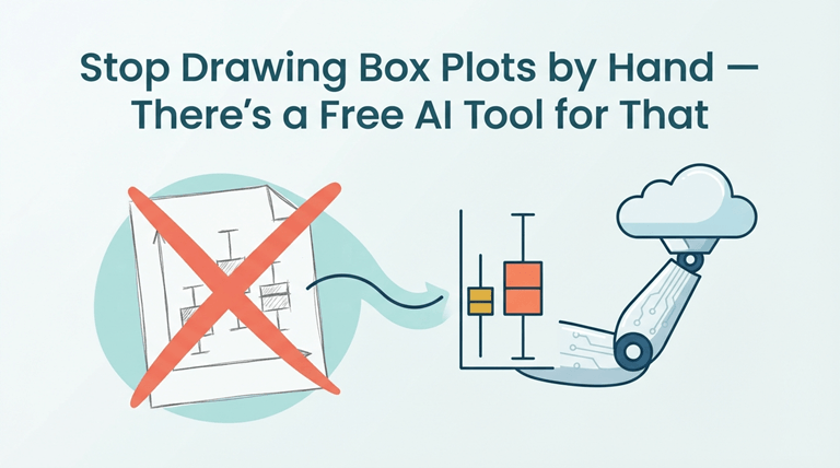
The 30-Minute Problem Nobody Talks About
Let’s use the example that a colleague sends in a CSV to Slack. “Hey, can you see how this is spread out in these 6 groups?”
When you reach for Excel, you do the tedious work calculating quartiles, deal with the chart wizard, discover that there’s no notched whisker option, export to a mediocre-looking picture, and send it back 25 minutes later. Your co-worker has already passed on to the next.
If you go and get Python, you will have to import libraries, clean the data, tweak matplotlib parameters, and export it — only for the recipient to point out that they can’t open a .py file.
This gap between “I have data” and “I have insight” is where a free box plot maker changes everything.
What the Tool Actually Does (In One Sentence)
Enter your numbers, hit Generate, and have an outlier-detected, publication-ready box plot including the five-number summary and optionally statistical significance testing in less than 10 seconds.
No Excel. No Python. No sign-up.
The Features That Make It Different
Multi-Group Comparison That Scales
Most of the free chart tools only allow you to have two or 3 groups. This online box plot generator supports 10+ datasets at once, each with its own set of colors and switches. Analyze regional sales, A/B test, or monthly trends without moving to any spreadsheet tab at all.
Statistical Significance Without SPSS
When comparing several groups, it automatically performs pairwise significance tests (Welsh’s t-test, Mann-Whitney U) and shows p values and effect sizes. It used to be that anyone who wanted to carry out the type of analysis needed a degree in statistics and expensive software – but now it’s in your browser.
Overlays That Reveal Hidden Patterns
Switch between Jitter scatter, Beeswarm, Violin plots, and KDE density curves while they are all plotted on the same chart. Each shows a different aspect of your data distribution. A box gives you the quartiles, and a beeswarm will show you all the data points. They complement each other to present the complete picture.
Export Without Compromise
For sharp presentations, PNG 2x resolution. Create vector graphics for academic papers in SVG format. Comma-separated values (CSV) and Excel spreadsheets (XLSX) for more in-depth analysis. HTML standalone reports. No watermarking, no resolution limits, no export restrictions.
Who Benefits Most
Students who need to verify their manual quartile work. Researchers working on publication-quality figures. Analysts getting ready for the meeting just before it concludes. In real time, teachers who are demonstrating skewness and spread.
All the calculations are performed in your browser. No data is stored on a server.
The Bottom Line
Your tools influence the comprehension of your data. You are paying a “time tax” when you have to write Excel drop-down menus or Python scripts for a 10-second operation.
Try the free box plot maker at aiboxplot.com — paste your data and see your first chart in seconds.
Popular on OTW Right Now!




About The Author

Gagan Bhangu
Founder of otechworld.com and managing editor. He is a tech geek, web-developer, and blogger. He holds a master's degree in computer applications and making money online since 2015.