
Power BI Dashboard Filters and Slicers: A Practical Guide
A dashboard becomes difficult to use when every chart shows all available data at once. Users often need to narrow the view by date, region, department, product, or another field. Filters and slicers give them a simple way to do that.
Even though both tools decide which data is displayed, they do not work in exactly the same way. Filters work behind the scenes, while slicers give users visible controls on the report page. A report can be made much easier to explore by using them correctly.
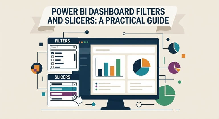
The guide explains how Power BI filters and slicers work in practice and also examines the differences between them, the various types, the options available when setting them up, and the mistakes one should avoid.
How Do Filters and Slicers Work in a Power BI Dashboard?
Filters and slicers narrow the data users see in a Power BI dashboard or report. The difference mainly comes down to where the control appears and how users interact with it.
Power BI Filters
Filters decide which data Power BI includes in a visual, on a page, or across the whole report; they are usually located in the Filters pane and so do not need extra space on the report canvas. Moreover, report creators can use them to establish conditions that users will have no need to change.
Power BI Slicers
Slicers are visual controls which are placed directly on the report page; a user is able to select a value, such as a year or a region, and the relevant visuals then respond to that selection. They are therefore useful in cases where people want to explore the data for themselves.
Filters and Slicers Together
Filters and slicers each have their own particular role; a report can use filters to exclude irrelevant records while at the same time providing users with slicers for dates and regions. When they are used together, they give control without having the effect of filling the page with unnecessary options.
What Types of Filters Can You Use in Power BI?
Power BI provides several filter levels, and each controls a different part of the report. Choosing the right level helps keep filtering predictable as users move between visuals and pages.
- Visual-level filters: Apply only to a selected chart, table, card, or other visual.
- Page-level filters: Affect relevant visuals across one complete report page.
- Report-level filters: Apply the same filtering condition across all report pages.
- Drillthrough filters: Carry selected context into a more detailed report page.
- Basic filters: Let you include or exclude specific values within a field.
- Advanced filters: Use conditions such as contains, starts with, or greater than.
- Top N filters: Limit results to top or bottom performers based on a selected measure.
Power BI Filters vs Slicers: What Is the Difference?
Filters and slicers may often lead to the same visible outcome, but the user experience differs since filters primarily deal with data rules, whereas slicers make it easier for users to change those choices.
It is useful to use a filter when a condition needs to be applied without occupying space on the page. For instance, you could omit cancelled transactions from a report without requiring users to make that selection themselves. The report therefore remains cleaner while still showing the desired data.
It’s easier to understand what slicers do when users have the habit of changing what they are looking at. For example, a regional manager could switch from one location to another, while a sales leader could change the reporting period. The fact that these controls stay visible means that users can quickly see which options are available.
In reality, good reports usually make use of both rather than picking just one; filters are used for rules that should stay as they are, while slicers are for those frequent choices made by users. The appropriate balance will vary according to how the report is expected to be used.
Common Types of Power BI Slicers
The way in which Power BI slicers display values will vary according to the field in question and the amount of space available in the report. Generally speaking, the most suitable format is the one that allows for a typical selection to be made quickly and clearly.
List and Dropdown Slicers
The values that are available are shown directly on the report page by means of list slicers; dropdowns offer the same choices but take up less canvas space. A dropdown is usually better to use when a field has a large number of options.
Date Slicers
Date slicers enable users to concentrate on a particular period or date range. They are helpful in cases where users frequently compare performance over different periods. The date controls that are available should correspond with the way the report is actually used.
Numeric Range Slicers
Using numeric slicers, users can choose values that fall within a certain range. For instance, a person could show products that have a price between $100 and $500. This method is suitable for fields like price, quantity, margin, or transaction value.
Best Practices for Using Filters and Slicers
The fact that more controls are added doesn’t mean that the report becomes more useful; filters and slicers should help users get the information they need without making the page more difficult to navigate.
- Keep frequently used slicers in a visible and consistent location.
- Use dropdown slicers when a field contains many possible values.
- Group related controls so users can understand their purpose quickly.
- Avoid showing filters that most users will never need to change.
- Make active selections clear so users know what affects the results.
- Test how multiple slicers behave when users combine several selections.
- Keep similar filtering patterns consistent across related report pages.
How to Control Slicer Interactions Across Power BI Visuals
It is not necessary for a slicer to control each visual on the page; instead, Power BI enables report creators to determine how each individual visual should react when a user makes a selection.
Filtering a Visual
The most frequent type of interaction is filtering; when a user selects a region the visual display that is connected to it is updated so as to show only the data for that region. This approach is effective whenever multiple charts are required to display the same filtered view.
Highlighting Data
Certain visuals have the capability of emphasizing the data that has been selected rather than eliminating all the rest. This way the overall context remains visible while at the same time drawing attention to the part that has been selected. It is useful to highlight when comparisons are just as important as the filtered value itself.
Keeping a Visual Unchanged
Some visuals might have to be kept independent of a slicer. For instance, a company-wide KPI could remain unchanged while the regional charts vary around it. When the interaction is disabled, the slicer can no longer change that visual.
Using Filters and Slicers in a Power BI Finance Dashboard
A Power BI finance dashboard often contains several views of revenue, expenses, budgets, margins, and financial performance. Filters and slicers help users move between these views without creating separate reports for every question.
Finance teams have the option of using date controls to move from one month to another, or between quarters and reporting periods. If users want the results to be limited to a particular section of the organisation, they can make selections by department or business unit. When users need to examine individual figures, account or category filters can be used to add another level of detail.
What matters is that the controls should be geared towards the actual reporting requirements. Having too many slicers can make a finance dashboard seem more like a configuration screen than a reporting tool, and using a smaller number of useful controls generally results in a cleaner user experience.
Common Power BI Filter and Slicer Mistakes to Avoid
Filters ought to simplify the process of exploring reports, but inadequate setup can lead to the contrary result. When a report is about to be published, it is important to verify the way filtering works on different pages, visuals, and in response to user selections.
- Adding too many slicers and leaving little room for actual report visuals.
- Using different filter layouts across pages without a clear reason.
- Allowing slicers to change visuals that should remain fixed.
- Hiding important active filters so users cannot explain changing results.
- Using long lists where a searchable dropdown would work better.
- Applying report-level filters without making their effect clear to users.
- Giving users filtering choices that do not support a real reporting task.
Conclusion
Power BI addresses the same fundamental problem in different ways by using filters and slicers: filters allow report creators to decide which data is displayed, while slicers enable users to change the important views directly from the report.
The best reports don’t include controls just because Power BI provides them; instead, they apply filters to rules that should stay consistent and use slicers for the decisions that users actually need to make.
When both are planned around real reporting needs, dashboards become easier to navigate and understand. Users spend less time figuring out the controls and more time working with the information in front of them.
Popular on OTW Right Now!



About The Author

Gagan Bhangu
Founder of otechworld.com and managing editor. He is a tech geek, web-developer, and blogger. He holds a master's degree in computer applications and making money online since 2015.