
Cleaning up a product photo with Designkit
Say you’ve got a good photograph of a bag. The stitching is clear. The leather looks the right color. Behind it, though, there’s a chair and a dark corner of the desk. Cropping them out would also cut off the strap.
I’d keep that photograph. Setting everything up again seems unnecessary when the bag itself looks fine. A background remover is worth trying here, although the strap would be my first concern. There isn’t much contrast between it and the desk.
Designkit does the removal in a browser. The resulting cutout can go onto a plain background or into another design. Resizing is available too, so the original photograph doesn’t have to fit every layout as it stands.
The first photograph
For this example, the bag photograph goes into the Designkit background remover. The file can be JPG, JPEG, PNG or WebP. There’s no account to create at the preview stage. I’d leave the download until after looking at the strap; seeing the whole bag on screen isn’t quite enough.
Look inside the loop of the strap first. That piece of desk should be gone. Then there’s the bit of strap over the shadow. Is it still there all the way around? A missing section might not look wrong at first. The remaining shape could pass for a shorter handle.
Enlarge the preview. I’d have the original open too. The buckle and stitching are easier to judge with both pictures in view. Something that looks like a rough edge in the cutout may be in the leather itself. No need to tidy that away.
On white, a little pale border could escape notice. Put dark blue behind it and that border has nowhere to hide.
And if the strap has lost a section, another photograph may save some trouble. One with more contrast behind the strap would be a better starting point.
The dark patch inside the bag needs some thought too. Is it the lining, or the desk showing through? The original should make that clear. If the lining has gone along with the desk, this cutout needs another look.
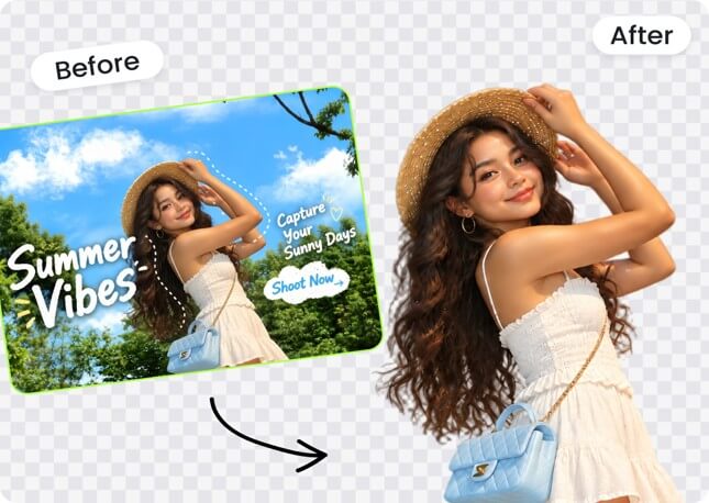
What belongs in the frame
A plain white shop image gives the bag room on its own. I wouldn’t let the strap touch the top edge. A little room on either side helps too; otherwise the bag looks wedged into its square.
The small view is where the framing can get awkward. Too much space and the bag becomes hard to see. Too little and the handle almost touches the edge. I would adjust that in the listing preview, where the photograph is actually going to appear.
I’d save a PNG with no background for the banner. That way, the bag can go straight onto the banner color, with the offer beside it. Keep that clean copy before adding any sale text. You’ll want it when the promotion ends.
A brown background might suit the shop’s colors. Whether it suits this particular bag is another question. With brown leather against brown, the outline could become hard to follow. I’d try something lighter and see whether the edge comes back into view. Check the original. Does it still look like the same leather?
The buckle is a tempting spot for a price label. There’s room, and the wording might fit. But now the buyer can’t see the buckle. I’d rather put the price off to one side, even if that means shifting things around. If there isn’t enough room, make the bag a little smaller within the banner.
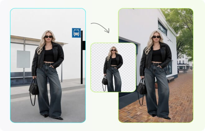
Bringing the other pictures in
Place the next listing beside the first. Similar bags can look quite different in size if one fills the frame and the other has space all around it. A matching background alone won’t fix that.
The camera angle matters here too. Looking down into the bag gives one view. Facing it straight on gives you the front instead. Both can belong in the listing. Trying to crop them into matching outlines would lose some of what each photograph has to show.
Allow for different shapes, though. A long strap needs room that a short handle doesn’t. Forcing both into exactly the same crop could mean cutting something off.
Some photographs can stay as they are. The shot of someone wearing the bag shows how far down it hangs. It also gives the buyer something familiar to judge its size against. Removing the person would lose that information.
Designkit supports up to 15 images in a batch. I’d use that after settling the background and framing for the first product. I wouldn’t assume every handle came out like the first one. A gap might still contain some desk, or a bit of fringe might have gone missing. Those are easy places to overlook in a row of previews.
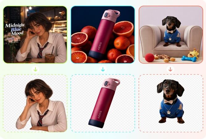
Saving the files
Full-size downloads require sign-in. Designkit’s published free allowance is up to 100 exports a day. I would keep the originals in the same folder as the finished copies.
Give each file a name that identifies the bag and the view. Front, back and buckle are easier to recognize than a string of nearly identical camera filenames. Keep the transparent version separate from the finished banner, so the next campaign doesn’t start with yesterday’s wording.
Resizing for a banner may mean leaving more space on one side for the headline. The listing crop is a starting point, so there’s no need to squeeze it into the wider layout unchanged.
For anyone considering a remove.bg alternative, this bag photograph would also make a useful comparison. Give both tools the same file. Compare the downloaded images at the same size, with the same color behind them. The narrow strap and buckle give you something specific to judge.
Finally, put the image into a draft listing and open the large view. Background removal won’t recover an out-of-focus label. If the label still can’t be read, take that missing shot before putting the bag away.
Popular on OTW Right Now!


About The Author

Gagan Bhangu
Founder of otechworld.com and managing editor. He is a tech geek, web-developer, and blogger. He holds a master's degree in computer applications and making money online since 2015.