
How to Choose the Right Logo for Your Business Website: A Complete Guide for Startups
Introduction
A site is most likely the first impression your customers will have of your business. It takes a visitor just the first second to make a judgment when viewing a brand. Although website speed, content, and navigation are all significant aspects of the first impression, there’s one more factor your business owners might not be aware of: Your logo will do its work without them realizing it.
A logo is more than just a decorative graphic. It’s a symbol of your brand personality, values, and professionalism. By using the right logo, your visitors will remember your name, know your brand, nd and be more at ease communicating and interacting with you, whether you are a startup or an online business, a blog or a service provider.
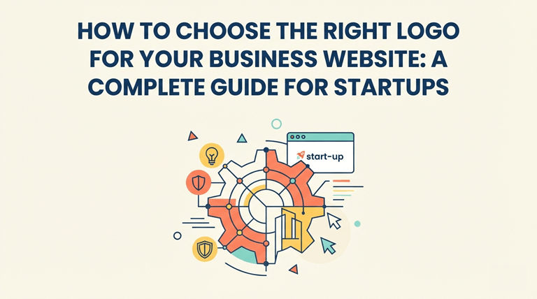
But, numerous new business owners do not design their logo until after they have started their business. Some opt for random templates, and some for poor-quality templates, which are not a good visual representation of the brand. No matter how insignificant it might appear, a poor logo will affect the credibility of your website and tarnish your reputation among your customers.
But a quality logo will help to unify your website, social media, email signatures, business cards, and any other marketing you use. It becomes your image that your customers will connect your products/services with.
You’ll discover how to pick the ideal logo for your business website, what makes a great logo design, how to steer clear of common logo design mistakes, and how you can ensure that your logo will be a part of your marketing moving forward.
Your website logo is among the most crucial elements of your website
If you’re about to come up with tips on designing, you need to know why it’s crucial to take the time to focus on your logo.
Your logo appears on your brand in any and all places, for instance, on ads or blogs. It’s used in the header of your site, browser tabs, invoices, newsletters, Facebook, Twitter and other social media pages, presentations and even on some product packaging.
Having a really good logo can offer a number of advantages.
Has a long-lasting activity. Produces a good impression on people’s initial contact with them
After many years of study, it has been determined that visitors will make a decision about your website in a matter of seconds. The first few minutes will be assessed for your professionalism, trustworthiness, and overall quality.
With a neat and tidy logo, you’ll know that attention to detail is a strong focus in your business. It lets customers know that your company is trustworthy and dedicated to delivering a great customer experience.
It helps to establish brand recognition.
Think of a number of well-known brands all around the globe. Often it is possible to identify the logos of companies without ever seeing the company’s name.
While it’s not every business that needs to be international, all businesses need to be memorable.
Your logo will be seen by your customers many times over different media and your logo will begin to become synonymous with your products, services, and experience. With time, this comes with trust.
It helps to create uniformity of the products. It gives uniformity to your brand.
Branding is one of the principles of consistency.
When using the same color, font, graphics and style in your logo and website, you are creating a more organized and professional look to your business. It also enables the company to easily achieve its marketing goals in the future as all aspects of the company’s brand are interlinked.
It’s a component of the development of Customer trust. It results in higher Customer trust.
If any individual visits a certain business, the natural faith they have in businesses that seem established.
Your logo will help to take away any confusion from your first-time visitors and will give your site a professional appearance. Even if your company is new, branding can help build trust and encourage consumers to look into your products/service in depth.
Gaining insight into your brand is essential before starting to design your logo.
Many businesses take the easy way out and opt for a logo without defining their brand identity.
Your logo should tell people who you are, rather than just look pretty.
There are a few questions that you need to ask yourself before choosing colors, ffontss or symbols.
Who would you like to write your book for?
Various audiences have various visual preferences.
For example:
- A stylish, elegant logo can help a law firm stand out.
- A kid’s apparel firm could utilize dazzling hues and enjoyable lettering.
- Minimalist design is typically a better fit for technology startups.
- The first choice for a luxury brand is to select a beautiful and classy one.
Knowing your target audience means that your logo is sure to resonate with the ones who mean the most to you.
What are you representing? What is your business’s mission statement?
All brands come with a persona.
Your business may be:
- Innovative
- Professional
- Friendly
- Reliable
- Creative
- Premium
- Affordable
- Minimalist
These should be displayed visually in your logo.
In the case of a cyber security firm, for instance, they are likely to have a different kind of visual branding compared to an organic bakery, when both have an internet presence.
Identifying what sets your business apart
Ask yourself:
- What makes you/can you stand out from the crowd to become their favored option?
- What’s the issue you are addressing?
- What are your company’s values?
The answers are frequently the stimulants for a meaningful design thought and not just another graph.
The types of Logos differ depending on what you are using them for.
All successful logos do not look alike. The choice of type is meant to be narrowed down by your business name, industry, and business branding.
1. Wordmark Logos
A wordmark employs just the business name in a unique typeface.
These range from many software businesses, consulting firms, and online brands, which have brief and memorable names.
Wordmarks tend to be effective for companies with a simple name that is easy to remember.
2. Lettermark Logos
The name of the business is not displayed, and initials are used instead of lettermarks.
This is the perfect style to use for companies that are long.
Typography begins to play a vital role in creating a visual identity, particularly as it is used to define clean typography.
3. Symbol or Icon Logos
Some companies opt to use an icon that is just a logo of the company.
This can easily become very recognizable over time, and newer businesses tend to have the icon attached to the business name until they become well-known.
4. Combination Logos
A combination logo is a logo with text and a graphical element.
One of the most multi-purpose choices is actually this since it helps each recognize and can be used flexibly on other marketing items.
This style is the most popular one for many little businesses because of this element of balance in branding and readability.
5. Emblem Logos
The emblem is when the business name is enclosed within a badge, shield, or round-shaped design.
Usually, these logos have an urban feel and convey tradition, authority, and heritage, being favored by educational institutions, restaurants, automotive enterprises, and sports organizations.
A great website logo should possess a number of characteristics. A good website logo has a number of properties:
While all logos have to be their own, there are some common attributes of good logos.
Simplicity
The simple logos will be easier to recognize anremembered.
Keep in mind that you do not need to include all the details, just a clean design that communicates your brand.
Also keep in mind your logo could be displayed as a small browser favicon, social media profile image or mobile app icon. Artwork with detail or complexity may not be as clear at a smaller size.
Memorability
Your logo should be memorable to people after a few exposures.
The logo is memorable, thanks to its unique typography, careful spacing, and well-balanced design.
Versatility
The best logo should be versatile and suitable for variousmedias.
The logo you choose should be professional-looking on:
- Your website
- Mobile devices
- Business cards
- Email signatures
- Social media profiles
- Product packaging
- Marketing materials
- Presentations
If your logo can only be used in a single size and color, it can cause branding problems later on.
The importance of selecting appropriate colors for your logo
Color is among the foremost points that people will notice about a logo. It’s not only aesthetically pleasing, but it also affects the view of your brand. Colors are strong communicators of emotion, and selecting the color palette is crucial to developing a great logo.
Although there aren’t hard-and-fast guidelines, knowing some basic color psychology can assist in making finer branding choices.
Blue – Dependable and Trustworthy
Professionalism, stability, and trust: these are some of the reasons why blue is one of the most popular colors in branding. It is commonly used by businesses such as technology firms, financial institutions, software companies, and corporate businesses.
Blue is a good color to use if you want to ensure that your visitors feel confident about your services.
Green – Growth and Nature
Green signifies health, sustainability, freshness, and growth. The green color is frequently used in businesses that have something to do with wellness, eco-friendly products, finance, or education to convey progress and balance.
Red – Relaxation and Rejuvenation
Red is a noticeable color. It represents excitement, passion, confidence, and urgency. But it must be used with caution, as an excessive amount of red will look overwhelming unless balanced with neutral colors.
Black – Elegance and Authority (Formal)
Black is a classy and upscale look. Black is often used in luxury brands, fashion brands and high-end service providers to create a sense of exclusivity and professionalism.
Colors in this group are Orange and Yellow – Creativity and Optimism.
These colours evoke a sense of warmth and liveliness. These are typically good choices for start-ups, creatives, educational websites, and brands aimed at young audiences.
Using too many colors will only increase the clutter.
A frequent error is attempting to have an outline that features all of the favorite colors.
Successful logos are made up of just about two or three primary colors. A minimal color scheme helps to distinguish your brand and improves consistency throughout the web and marketing.
Keep in mind your logo will also have to be legible and appealing in grey or black & white should you need to go without color printing.
Selecting the Right Typography
Colors are not the only way to convey personality, fonts do as well.
The playful handwritten lettering will convey a different message than the clean, geometric hand.
Select fonts that are easy to read, rather than decorative.
Serif Fonts
Serif fonts have small decorative strokes on each letter.
They often communicate:
- Tradition
- Reliability
- Professionalism
- Authority
These fonts are suitable for consulting firms, law firms, educational institutions and high-end brands.
Sans-Serif Fonts
Sans-serif fonts have a cleaner and more modern appearance.
They’re commonly used by:
- Technology companies
- SaaS businesses
- Startups
- Online services
- Digital agencies
Sans-serif fonts are still one of the most popular web font styles since they’re simple to read on screen.
Script Fonts
Script fonts mimic handwriting and have a personal or elegant touch.
They should be used with caution however.
No one wants to misspell your business name in the logo, as its main function is to be easily understood.
Avoid Using Too Many Fonts
A logo should have a unity feel.
Mixing different and unrelated fonts can make the design look unprofessional and cluttered.
Usually, only one font is sufficient; it’s just that it has to be one that you’ve chosen carefully.
When choosing a logo, keep in mind that it will need to fit all sizes.
Your logo doesn’t just have to be in your website header.
In today’s digital world, companies put their logos on dozens of online platforms, such as:
- Website headers
- Browser favicons
- Mobile applications
- Email newsletters
- Social media pictures of oneself
- Business cards
- Presentation slides
- Product packaging
- Digital advertisements
As a result, your Logo needs to be crisp and readable in all circumstances and sizes.
Test Small Versions
Many logos appear lovely on a big computer screen, but are hard to read when scaled down.
Make your logo small, or small for mobile usage.
Ask yourself:
- Can you still read the business name?
- Can they still be seen?
- Are the icons still easily identifiable?
Otherwise, the design may need to be simplified for it to be more effective.
It is crucial for everyone to understand that responsible logos are essential.
Responsive web design is now the norm, and so should be branding.
A reactive logo will resize but keep its identity on various screen sizes.
For instance, a company could employ:
- A company logo displayed in the website header
- An easy-to-read horizontal format for tablets
- A mobile icon-only version.
- Mobile browser icon for the device
This flexibility means that your brand is recognizable all the time.
Choose the Right File Format
If a logo is not exported in the appropriate format, it can look blurred.
This is the list of the most popular logo file formats.
SVG
Because of its vector-based nature, SVG is the perfect file type for websites.
Advantages include:
- Sharp at all screen sizes
- Small file size
- Fast loading
- Ideal for responsive websites.
Google Search Central also states that it is important to use well-optimized images to enhance the website’s performance and user experience. Opt for lightweight, scalable formats such as SVG for quicker loading times and improved usability.
PNG
PNG can be used with transparency, which allows it to be used in websites, presentations, and documents.
While PNG is not scalable, like SVG, it does haveits usese.
JPG
JPG is suitable for photos, but not logos as it does not support transparency and can cause loss of quality with repeated editing.
PDF or AI Files
Typically stored as master files to be printed or edited later.
It is always advisable for business owners to have the original editable version of their business logo on hand in case of changes happening in the future.
Use a light and dark background design if necessary
Dark mode is now included in many modern websites.
An ideal logo for a white background might not be apparent on dark pages.
Therefore, it’s advisable to create at least two types of logos:
- Version for light background
- Dark background version
This small change will make things easier to read and will look professional in different devices and themes.
Ensure that your brand is the same on all platforms
Brand consistency is a helpful tool for customers to identify your business anywhere they come across it.
Your logo should be consistent and recognizable in:
- Website
- X (Twitter)
- YouTube
- Email signatures
- Business documents
- Marketing banners
- Packaging
- Digital advertisements
Do not alter colors, proportions or typography between different platforms.
Tiny inconsistencies can have a negative impact in the long run.
Rather, develop a basic brand style guide for use that spells out:
- Logo spacing
- Approved colors
- Font usage
- Minimum logo size
- Background variations
- Acceptable logo versions
Clear guidelines will help designers, marketers and team create a consistent brand identity.
Where to put Your Logo on a website
The use of logos isn’t something trivial, but it has an impact on both the branding and the user experience.
It is common for most websites to have their logo in the top left corner of the header, as visitors should know where to look.
This common location also makes it easy to click on the logo and head back to the homepage, enhancing the navigation of the website.
Whatever position you put it in, make sure you have plenty of white space around your logo. Keeping your website cluttered by adding too many menus, buttons, or banners can diminish the impact of your website.
Having a clean header with a correctly placed logo enables your website to have a professional appearance and makes it easier to navigate.
The following are some of the common logo design pitfalls to avoid.
Creating a logo might sound simple enough, but many companies make choices that lessen the impact of their brand. A logo should establish your business’s memory, it should not get in the way of them! In the long run, these are common pitfalls to avoid, and doing so could save you time and money.
Trends are the ones that drive change, and they can hit at any moment.
Fashion trends come and go on an annual basis. What you believe is a contemporary logo today can go very quickly out of style.
Don’t go with the fads; stick to a classic design. Simple shapes, proportions, and typography are often good for a long time. A good logo is one that will not require constant changes, either.
Too many design elements can be distracting and detract from their effectiveness.
Some business owners will attempt to incorporate everything in a single logo, with many colors, intricate illustrations, patterns, and decorative effects.
This typically has the opposite effect of what they want.
The more cluttered the logo, the harder it will be to recognize, scale, and remember. Simple, in most cases, makes for a more robust visual identity.
Choosing the Wrong Font
Typography is a significant aspect of brand perception.
For instance, a fun handwritten typeface for a financial consultancy firm could make the business look untrustworthy. Similarly, a brand that is designed for children may not resonate with the target audience if the typeface is too formal.
Select fonts that are readable and convey your brand images.
Ignoring Scalability
Some logos work great when viewed on a designer’s computer, but they don’t look so great at a smaller scale.
Test your logo in several sizes before it’s finalized. It needs to be recognizable when it’s displayed as a favicon on a website, a profile image on social media, or a big banner.
Copying Other Brands
While it’s all right to get ideas from successful companies, copying another logo can lead to credibility issues and legal problems.
Your logo should be a reflection of your own business and make your business stand out from the competition.
Originality will make your business more memorable, and it will create long-term brand value.
Create Your Own Logo or Get It Done by a Professional Designer
Back then, there were a few tools available online, and they were quite expensive to use. Now, there are numerous tools available online that anyone can use to create a logo in minutes. These platforms can be beneficial for testing concepts or for starting a small project, but they don’t always deliver the flexibility or originality that might be necessary for more lasting branding.
Let’s take a quick look at a comparison.
DIY Logo Design
Pros:
- Budget-friendly
- Quick to create
- Appropriate for individual projects
- Simple to try various looks
Cons:
- Limited customization
- Generic templates
- The business structure could be incorporated in similar designs already in use by other firms.
- May not be suitable for all brand materials.
Working with a Professional Designer
Pros:
- Custom design that is specific to your business. Unique business-specific design.
- Stronger brand identity
- Improved scalability and file preparation
- Professional advice on colors, typography, and usability
Cons:
- Higher initial investment
- Needs teamwork and input in the design process
In the long run, companies that want to expand can find it more worthwhile to invest in a professional logo design than a generic template.
Although logo makers can be useful for some easy logo projects, companies that want to develop a powerful, memorable branding may want to hire a professional for a Cartoon Logo Design. The custom logo is designed keeping your brand identity, target audience, andlong-termm goals in view, leading to a much better chance of standing out in a crowded online market.
When is the time to redesign your logo?
Not all logos have to be changed. Some brands are able to market the same name over the years and apply a few tweaks that don’t make it so different that no one can recognize it.
But there are times when it’s appropriate to redesign your logo.
If any of the following apply, you should consider redesigning:
- Your logo is out of date.
- Your business has evolved its products and/or services.
- You’ve changed your company’s name.
- Your current logo doesn’t display well on mobile devices.
- It’s hard for customers to identify or recall.
- It no longer represents your values and target audience.
If you’re going to change your logo, don’t do it too much unless it is necessary. Slowly enhancing your brand will help your existing customers continue seeing your brand and help make it look fresh.
Create a successful landing page. Imagine beyond your website
Your website might be the first place a user encounters your brand, but your logo should be part of your brand’s system.
Think your customer finds you on social media and clicks your website link, then gets your website email newsletter, and then ends up at an event with your business card.
A unified logo creates a cohesive experience throughout all the touchpoints.
As you look at your final design, consider these questions:
- Is it professional-looking on desktop and mobile devices?
- Does it scale fine at a large and small size?
- Is it in line with my brand personality?
- Is it still relevant 5 years from now?
- Is it suitable for print and electronic applications, and maintains quality?
If you answered “yes” to these questions, you are on the right track.
To wrap things up, here are a few final tips to keep in mind when selecting the perfect logo
Prior to making your decisions, consider these practical suggestions:
- Don’t design just for the trend; instead, consider your audience first.
- Maintain a neat and simple design.
- Use a limited colour palette to be consistent.
- Select typography that aligns with your brand image.
- Make sure that your logo is responsive for both desktop and mobile platforms.
- Create your logo in various formats to fit different situations.
- Try your logo against a light background and a dark background.
- Develop basic brand rules that will help establish consistency as your company expands.
- Don’t rush the process; a logo is an investment in your brand’s long-term identity.
The correct use of a logo can be a minor aspect of your site, but it will make a difference in how visitors view your business from the first time they see it.
Conclusion
Your logo is one of your most valuable visual assets, and your business will always have it. It makes your brand memorable, conveys professionalism, and reinforces the brand.
Don’t design a logo just because you like the look; instead, consider that you’re designing a logo that reflects your business objectives, resonates with your target market, and will be impactful on all platforms where your brand will be used.
If you are creating your first website or updating your brand, then you should take the time to invest in your logo. A well-thought-out, timeless design can help your website stand out in years to come, build trust with your customers, and be part of your marketing strategy.
Keep in mind that the most detailed or colorful logo is not necessarily the best one; a great logo is clear and resonates with your business.
Frequently asked questions (FAQs)
1. What makes a good business website logo?
A good logo should be simple, memorable, scalable, and relevant to your brand. It should be tasteful, professional, and identifiable through various marketing platforms, both on desktop and mobile platforms.
2. What is the logo type that works best on websites?
SVG is typically the best choice since it retains excellent clarity at all sizes and dimensions, but is still compact. Another use of PNG is when transparency is needed.
3. What colours does a logo need to be?
The best logos will generally rely on one or two basic hues. Using a limited color palette helps to ensure consistency and helps the logo to be recognized.
4. Is it advisable to hire a professional to design a logo for startups?
Having a professional designer create a brand logo can make a difference if you have long-term business plans that involve branding and making your brand known.
5. Will I be allowed to change my logo in the future?
Yes. As businesses grow and change, they redesign their logos as well. But significant changes need to be implemented with a degree of caution to maintain familiarity amongst customers and the brand, respectively.
6. A responsive logo is essential for a number of reasons.
A responsive logo resizes and adjusts to various screens and layouts. This will help that your brand is always easy to understand and remember, irrespective of the device your visitors are using to access your website.
7. Does a logo have an impact on customer trust?
Yes. Although a logo alone will not make or break a business, having a clean and professional design will help leave a positive impression and can help build credibility on new visitors.
8. What is the best way to update my logo?
The time frame is not set. If your logo still conveys meaning for your brand and fits on contemporary digital devices, you might not need to redesign your logo. These updates are typically worth the time when there are major changes to your business or your current logo simply doesn’t fulfill practical design specifications.
Author Bio:
Serina Adam is a Senior Logo Designer at CartoonLogoX, assisting startups and businesses with creating memorable logos and brand solutions. She loves to present to businesses valuable information about branding that will improve their online visibility.
Popular on OTW Right Now!


About The Author

Gagan Bhangu
Founder of otechworld.com and managing editor. He is a tech geek, web-developer, and blogger. He holds a master's degree in computer applications and making money online since 2015.