
How the Right Email Template Directly Impacts Your Sales
Most businesses obsess over their subject lines and send times, then drop a tired, cluttered layout into the inbox and wonder why nobody buys. The truth is simpler than most marketers want to admit. Your email template is doing the selling, or it is quietly killing the sale before a reader ever reaches your offer.
A template is not decoration. It controls how fast someone understands your message, how much they trust your brand, and whether their eyes land on the button you want them to click. Get it right, and the same email list produces more revenue with zero extra traffic. Get it wrong, and your best campaign still falls flat.
This article breaks down exactly how the right email template moves money, the design choices that drive conversions, the mistakes that quietly cost you sales, and how to build high-converting emails without touching a line of code.
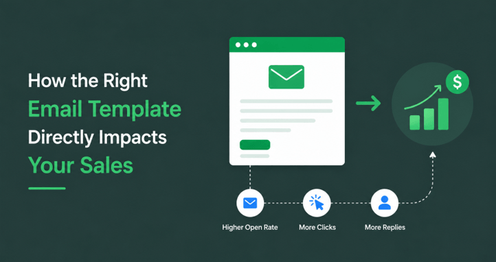
Your Template Is the Salesperson in the Inbox
Picture a great salesperson. They are clear, confident, easy to follow, and they guide you to a decision without making you work for it. A strong email template does the same job at scale. It presents your offer in a logical order, removes friction, and points to one obvious next step.
A weak template behaves like a nervous, disorganized salesperson. The message is buried, the layout fights the reader, and the call to action hides somewhere near the bottom. People do not push through that. They close the email and move on.
This is why email templates for sales are not a design nicety. They are a revenue lever. The layout decides what gets seen first, what gets ignored, and how quickly a reader reaches the moment of action. When you treat your template as a silent salesperson, every design choice becomes a conversion choice. The good news is that the right email template builder makes those choices simple. A visual HTML email editor lets you shape that logical flow without touching code, and starting from a proven drag-and-drop email template means the structure already works in your favor.
Why Template Design Moves Revenue Directly
The link between layout and sales is not vague. It runs through a few concrete mechanisms that you can control.
The clearer it is, the quicker the decision. Readers skim. Their template is very clean with a clear visual hierarchy, which allows them to understand the offer within a few seconds. The sooner they realize it’s worth the sooner they will do it. Work is forced when it’s in a disorganized environment, and work is the enemy of conversion.
Trust lowers hesitation. The uniformity and sophistication of the design indicate a professional and attentive approach to your business. At the moment, people are making decisions about whether or not to spend money; that trust is what’s most important. When you send an email that’s not very well put together, there’s uncertainty, and then there’s the delay in the sale.
The click is what is driven by focus. Conducting email templates directs focus to one action. The more people can click when the layout eliminates distractions and highlights one call to action, the more clicks you’ll get. The more links you compete with on one page, or if you clutter it up, the less attention you’re getting towards the conversion of emails.
Mobile rendering helps to preserve sales. The vast majority of email messages are viewed on mobile devices. Buyers will not ever view the offer properly if your template breaks, elongates, or contracts text on mobile. It’s no longer an option; it’s a requirement. It’s the difference between an email you are able to read and an email that never gets read at all.
It is one of the reasons that high speed keeps people in. Large templates take longer to load and may trigger spam filters. Lightweight code lands in the inbox and creates quickly, helping to keep viewers engaged for long enough to convert.
The Anatomy of a Sales-Driving Email Template
Strong sales emails share a structure. The order and clarity of these sections are what turn a reader into a buyer.
A focused header. Your subject line and logo tell readers who you are and what you’re trying to accomplish. This is done in the first second, setting the tone.
A clear hero section. One strong visual and one promise. All of that is up to the reader to choose to continue or to end. Tell people the benefit of what you have to offer, not the features.
Scannable body blocks. Short sections, generous spacing, and supporting visuals that build the case without overwhelming. Each block should move the reader one step closer to the action.
A single, obvious call to action. One main button, formatted to stand out, restates where appropriate. The reader should never have to search out the next step.
Trust signals. Reviews, ratings, guarantees, and/or a recognizable logo near the decision point to eliminate last-minute hesitation.
A clean footer.Contact information, social connections and a simple “unsubscribe” link which ensure compliance and credibility.
When these sections work together, the template carries the reader from curiosity to click without friction. That is what separates a pretty email from a profitable one.
Common Template Mistakes That Quietly Kill Sales
Many companies lose money due to poor design. There are many design problems that are solvable and cost businesses money. The following are the most commonly found ones.
Excessive numbers of CTAs. If you ask for 5 things, you will get 5 things. If you ask for 5, you’ll get 5. Competing buttons will distract and lead to a loss of conversions. Choose just one key action for each email.
Walls of text. Avoid using long paragraphs; they will cause readers to jump around. Use white space and short blocks of content, well-segmented with headings.
Poorly located and/or weak buttons. It’s hard to see if you don’t pay attention to a low-contrast link near the bottom. The primary thing you want people to do should be clear, prominent, and in the “hotspot” of a site.
Broken mobile layouts. If a design is good for a desktop and doesn’t work on a phone, then you’ve lost the majority of your audience. Always think and design mobile first.
Inconsistent branding. When using random fonts, colors, and styles throughout campaigns, trust is lost. Your emails will appear reliable when you are consistent,t and reliable brands will gain more sales.
Heavy, messy code. Excessive HTML can cause slow loading speeds and increase the possibility of spam. Clean code helps to ensure emails are fast and are in the main inbox, where they can actually be converted.
All these are leaks. Repair them, and you’re going to get back the sales you had to pay for to get.
There are, of course, many more than 7 email templates, but here are the top 7 and when to use each!
Our Top 7 Email Templates and When to Use Each
Having a great template is the first step to a great email. The layout determines the speed of delivery, the professional appearance of your brand, and whether or not your readers will click or scroll. We selected 7 of the very best email templates in olibraryrar and explained what they work best for and when to use each one.
All templates below are fully responsive, tested, and compatible with all mobile devices, Gmail, Outlook, and Apple Mail, and use clean and lightweight coding. Any of them can be opened in MailEditor, and may be customized to your brand, then exported as HTML ready-to-send.
1. Welcome Email Newsletter Template
Best for: greeting new subscribers and driving a strong first action.
Welcome Email Newsletter Template is one of the most useful designs you can utilize, as welcome emails boast a few of the greatest open rates of any email. It combines a warm and recognizable header with clean content blocks, which introduce your business and guide readers to the next action you want them to take. Having a single main call to action is key in the layout, just as a first impression should have. For example, include a welcome, expectations and a “must-do” to get them to sign up, such as a discount on their starter or a “next steps” guide. Note: don’t be afraid to keep the copy concise and start it with one particular invitation; don’t use a blanket thank you.
2. Business Growth Email Template
Best for: B2B outreach, agencies, and service providers selling to other companies.
The Business Growth Email Template has been created to put your company in a position of being an effective, results-based partner. It captures the reader’s attention with a strong headline and clearly outlines the services, outcomes, and one strong call to action in a structure that decision makers can scan in seconds. The problem with this design is that it focuses on value rather than features – what B2B buyers want to see! Use it when you are running cold or warm outreach, you have a capabilities overview, or to follow up with a prospect. Of course, you can also switch out the hero copy for a particular client result or stat to create instant credibility and draw readers further into the email.
3. Onboarding Email Template
Best for: SaaS products, apps, and membership sites guiding new users.
The Onboarding Email Template guides users through setup and initial successes while keeping it simple and numbered. One of the largest ‘levers for reducing churn’ is a strong onboarding, getting them to the point where they see real value as they enter. The clean-cut design allows for easy readability on any device, which means that users will always be aware of what to do next. It’s a great way to immediately activate new accounts the second they sign up and keep the momentum going. Advice: break each step down to an individual action and connect directly to that step, instead of directing readers to a long help article, which slows them down.
4. Travel and Airline Deals Email Template
Best for: time-limited offers and urgency-driven promotions.
The Travel and Airline Deals – EMAIL TEMPLATE is ideal for those offers that require quick action. It displays offers, dates, and prices in a layout designed to make quick decisions – it shows what’s on offer, and it shows the dates you can obtain the offer. That structure encourages readers to take action before the expiration of the deal. It is created for travel, but can be utilized for any flash sale or limited-time promotion that individuals need to click on. Utilize it during seasonal sales, at the end of the week, or in countdown campaigns. Tip: include a countdown timer in the banner to make it more urgent, and ensure all the terms of the deal are clearly communicated so that readers can trust the deal.
5. Jewelry Collection Newsletter
Best for: visual ecommerce brands where the product sells itself.
The Jewelry Collection Newsletter features products front and center with abundant product images and easy-to-read product blocks. Where images might be the more potent selling factor in the category, this template will allow your photography to stand out from the information, pricing, and direct shop buttons. It’s perfect for fashion, jewellery, beauty, and any brand that is vision-led in retail. Display it to highlight new products, to display a collection, or to highlight best sellers. TIP: Only send your best products – the more the more you distribute, the more your attention is divided and the fewer clicks you will receive. A narrow grid will nearly always convert better than a full grid.
6. Booking Confirmation Email Template
Best for: appointment-based businesses and quiet upsell opportunities.
Booking Confirmation Email Template brings the confirmation of booking while maintaining your brand’s elegance and clarity. People can’t wait to see confirmation emails, as they want to double-check their booking, making them an ideal opportunity for a discreet next step. The layout is uncomplicated and tells all the necessary information clearly, which will help customers to feel secure at first glance. Can be used for hotels, salons, clinics, classes, and any service that operates on appointments. Consider placing a brief section proposing a related service or add-on below the confirmation details. It doesn’t get in the way of the main message, and it increases average order value.
7. Follow-Up Email Template
Best for: reopening quiet conversations and recovering stalled sales.
The Follow-Up Email Template is designed to re-engage emails that failed to get a response. More than half of sales close after only a few touches and not the first, so a clean and direct follow-up is likely to win back a sale that a first email could never have done. The message is tightly contained, and there is one reminder and one easy next step. Send it to the prospect to follow up on their response, chase proposals out of them, or reach out to the prospect when they don’t reply. Hint: use the previous email as a reference in the first line to make the email more personal and meaningful, not impersonal and robotic. It will always be better to have a warm “reminder” rather than a general one.
Different Sales Goals Need Different Templates
There are many points in the buying process, and a single layout won’t suit them all, so you’re spending money that you don’t have. It is a necessary part of the welcome email to introduce and invite. An email promoting message should be urgent and have a strong call to action. A Cart recovery email should be gently nudged, with a clear re-entry path back to it. To launch a product, one must anticipate it and give a good reveal.
The successful companies make their template library a tool kit. They match the appropriate layout to the appropriate goal and then make the appropriate format for the campaign. This is the benefit of ready-made and purpose-built designs, which can save you a ton of time. You don’t have to create a new structure for each send; you begin with an existing structure and adjust it. That translates to quicker production and uniformity throughout the entire process.
How to Build High-Converting Templates Without Code
Having a great template that you understand is another. Having one built quickly and with clean code that translates is another. This is where the right tool can make all the difference.
MailEditor is a drag-and-drop editor that creates neat, lightweight HTML, which will display correctly in Gmail, Outlook, Apple Mail, and mobile. No bloated code that fails to load on export and loads quickly and gets out of the spam folder. Create from a ready design, import and edit existing HTML, or create from scratch – without coding.
Email templates for sales contain all of the elements needed for the entire lifecycle, from welcome emails to promotional ones through to launches and recovery emails – you always have a leading place to start your emails from. The ability to reuse modules and sections saves time for busy teams and agencies, allowing them to quickly put together new emails. The finished design can be exported to 18 or more email service providers, which means that the same clean template can be exported for use in all platforms you’re already using. There’s even an embedded signature creator, so it is possible to make sure that all involvement is on brand.
The lesson to be learned: it’s elementary. You test more, ship more, and sell more when it takes minutes and not hours to build a high-converting layout.
The Bottom Line
Your e-mail template isn’t background information. It is the power that transforms views into profit. It’s the force that converts hits into profits. Having a clear structure helps build understanding, a consistent design helps build trust, a clear call to action helps increase clicks, and clean code helps protect deliverability. All of them directly impact your sales.
If your email is not converting as you would like, then it is time to check the layout of your email. Ensure you’re using the correct template for each goal, maintaining a design that is clean and focused, and providing one clear path to purchase for each email. Use proven, easily edited designs in MailEditor, then tailor them to your brand to make your next campaign a more effective sales channel.
Popular on OTW Right Now!
About The Author

Gagan Bhangu
Founder of otechworld.com and managing editor. He is a tech geek, web-developer, and blogger. He holds a master's degree in computer applications and making money online since 2015.