
Trade Show Booth Design in Orlando: What Works in a Convention City
When we had been at the national expo for three hours on day one, the booth team that I was with had obtained forty-one badge scans. The booth two aisles away had got zero. Although the industries were the same, the area occupied was the same and the budgets were similar. The reason for the difference was almost completely due to the layout.
Orlando makes the gap seem severe. One of the largest exhibition centres in the United States is the Orange County Convention Centre, and the exhibitions held there attract huge numbers of people from all the various sectors. Large halls deal more severely with poorly designed booths than do smaller ones, since visitors have a great deal to look at and little patience for anything that doesn’t appear clearly from twenty feet away.
This article deals with: the way in which your booth must be arranged for a hall of that size, the areas where most exhibitors in Orlando lose visitors, and a planning procedure you can follow before spending a single dollar. It is intended for the individual who is about to sign a contract and who wants to get it right the first time.
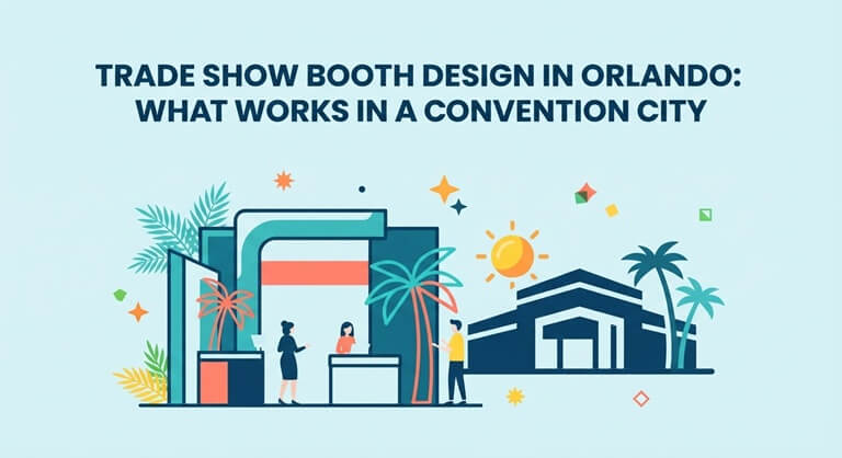
Why Orlando Booths Fail Differently Than Booths Anywhere Else
The advice given most of the time is based on the idea of a medium-sized regional venue, but Orlando is not like that. The hall is huge, the aisles are long, and your booth is having to compete with a constantly moving wall of light, video, and sound coming from hundreds of other exhibitors.
What this means above all else is that your booth must be successful from a distance. If people are unable to work out what you are selling as they pass by at normal speed, then the attractive interior finishes of yours are of no importance to them and will never be seen.
I’ve seen exhibitors spend a lot of money on a well-polished back wall and a comfortable meeting area, only to find themselves wondering why the aisle remains quiet. The back wall is aimed at the people who have already decided to stop. It is the sides facing the aisle that cause people to stop. These are two separate design tasks and most booths only deal with one.
The 20-foot test
Position yourself about twenty feet away from your booth, at eye level, and look at it for four seconds since that is the amount of time a passer-by will give you. Can you make out the brand? Can you identify the category? Is there something that is moving or illuminated which draws your attention? If any of these answers is no, then the design is not complete, even if the renderings look excellent.
Conduct the test on the floor plan, not just on the rendered image; the aisle width, the position of the columns, and the direction in which the crowd moves all affect the result. Each convention floor has a current, and a design that ignores it is working against the flow all day long.
The Anatomy of an Orlando Booth That Pulls People In
Booths that work in these halls share a predictable structure. It isn’t about style. It’s about function layered from the outside in.
- The perimeter: a low sightline of counters, demo stations, or a lit graphic edge that reads from the aisle. This does the recruiting.
- The center: room to stand, turn, and move without colliding with a stranger. Crowds form where people aren’t nervous about getting stuck.
- The back third: seating, private conversation space, and whatever you don’t want the whole aisle to see.
- The overhead: a hanging element or lit header that lets someone across the hall find you again an hour later.
More than most people who are new to the situation realize, the overhead display is important. In a room as large as a major convention hall, a hanging sign is usually the only way a returning visitor can find your booth. If there is no such sign, you’ll just be another rectangle amongst rectangles.
Lighting should be mentioned in its own right since rented LED panels and edge-lit walls have become the standard both because they deal very effectively with the issue of distance and because there is no need to own, store or ship them; for a company which is testing a new market, renting that component is generally the better first step.
If you want a concrete reference point for how much scale sits under one roof, the U.S. Census Bureau tracks convention and trade activity through its service sector data, and the totals make clear these halls are built for volume rather than intimacy.
Three Mistakes That Quietly Kill Traffic
Here’s where I stop being neutral. Most booth problems trace back to one of three choices, and all three come from designing for the people you already have rather than the people walking by.
1. Text you can only read from six feet
The textek wthell is a waa waa waste of money since no oneo oneo one reads it from tReservservserve writing for conversatiuse no more than use no moree no moreve that is words on that is anything that is facing outward.
2. Staff clustered inside the perimeter
A wall made up of your own people is like a closed door; no one will go into a group which is already occupied in talking to one another, whereas a single person positioned at the edge and facing towards the aisle alters the entire situation.
3. No clear first action
People decide within a few seconds if it is safe to stop. If a demonstration is running, there is the screen showing something in motion, or a counter with a person making eye contact, which provides them with a clear starting point; but if the area is empty and open, they have nothing to walk towards.
The third one is the one that’s tricky since a booth with no one in it looks perfectly all right in a rendered image; it’s only when people are actually present that it fails.
A Planning Sequence You Can Run Before You Spend
This is the order I’d work in, and I’d stick to it even under time pressure.
- Get the floor plan first. Booth number, neighbors, aisles, columns, and utility access. Design decisions made without this are guesses.
- Decide your one job. Booked meetings, badge scans, demo signups, or brand exposure. Pick one primary. Trying to do all four badly is the default failure mode.
- Design the aisle view before the interior. What reads at twenty feet, then ten, then up close.
- Choose buy versus rent. If this is your first or second show in a market, renting the heavy visual layer keeps capital free and cuts shipping and storage headaches.
- Plan staff positions on paper. Name who stands where and when, including breaks, so the perimeter never empties.
- Confirm setup windows and labor rules. Install and dismantle schedules at big halls are tight and regulated. Missing your window is an expensive mistake.
- Rehearse the four-second pitch. Everyone working the booth should say the same opening line. It sounds rigid. It works.
Engineering groups have studied crowd behavior at large events for decades, and the pattern holds across disciplines: people move along the path of least resistance. The IEEE publishes extensively on human factors in complex environments, and the practical takeaway for exhibitors is simple. You design for the walking crowd, not the standing one.
What to Look for in an Orlando Exhibit Partner
The questions which distinguish genuine operators from mere order-takers are easy to identify. You should ask about the way they deal with the work involved in installing and dismantling. You should find out who is on site during showing hours if a problem occurs. You should also ask what takes place if your crate turns up with a damaged graphic.
Companies that specialize in trade show booth design in Orlando tend to answer those questions with specifics, because they’ve lived the failure modes. Generalist shops answer with enthusiasm. Enthusiasm doesn’t fix a broken light box at 7 a.m. on opening day.
Another question to consider is whether or not they maintain their stock locally or have it shipped in; local staging is important in a city with such a full show schedule when a replacement part is required within hours rather than days.
A quick credibility checklist
- Named on-site contact for show hours
- Written install and dismantle timeline
- Photos of actual builds, not just renders
- Clear policy on graphic damage and reprints
- References from shows in the same venue
Similar agencies can be found all over the country, and organisations such as NASA have for a long time carried out research into how people orient themselves in large unfamiliar buildings. This principle applies as well in that having strong visual references and clear routes reduces the cognitive load on anyone who is navigating a large area, and your booth acts as one of those references whether or not you intended it to.
Bottom Line
Orlando rewards booths that read at distance, give people an obvious reason to stop, and keep the perimeter open and staffed. Everything else, the finishes, the furniture, the fancy interior, is a reward for the attendee who already walked in.
Get the aisle view right first. Rent the visual layer until you know the market. Then plan staff positions like they matter, because in a hall that size, they do.
Before your next contract goes out, do one thing: print your floor plan, tape it to a wall, and stand twenty feet back. What you see in four seconds is what your next thousand attendees will see too.
Popular on OTW Right Now!

About The Author

Gagan Bhangu
Founder of otechworld.com and managing editor. He is a tech geek, web-developer, and blogger. He holds a master's degree in computer applications and making money online since 2015.