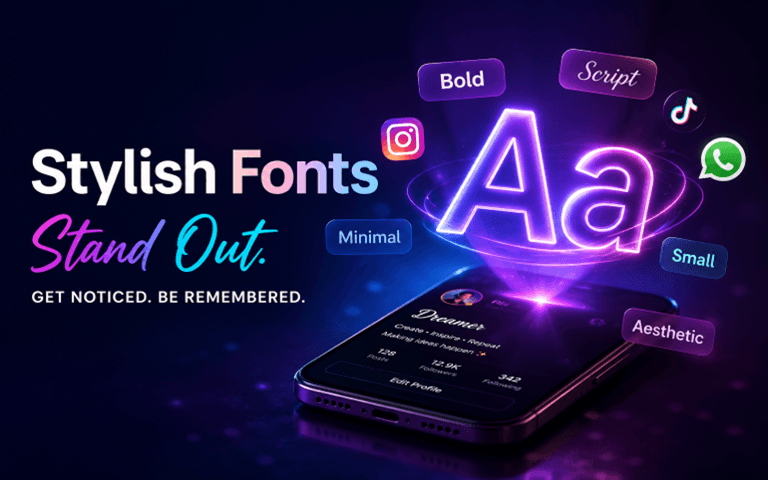
The Real Reason Stylish Fonts Are Taking Over the Internet (And How Creators Are Using Them to Stand Out)
Spend a few minutes scrolling through Instagram, TikTok, or even WhatsApp, and you’ll start to notice a pattern that wasn’t as obvious a few years ago. Profiles don’t look the same anymore. Text doesn’t look the same anymore. Even something as simple as a username or bio now feels carefully styled rather than casually written.
This change didn’t happen overnight. It’s the result of how competitive online spaces have become and how people are adapting to survive in that environment.
Today, attention is the most valuable currency on the internet. And attention doesn’t go to what is “good enough.” It goes to what looks different.
That’s where typography comes in.
Stylish fonts, custom text styles, and creative typography are no longer just design elements used by professionals. They’ve become everyday tools for creators, influencers, small businesses, and even casual users who simply want their profiles to look better than the rest.
The interesting part is that you don’t need to be a designer to do this anymore. Tools like a font generator have made it possible for anyone to instantly convert plain text into visually appealing styles without installing anything or learning complicated software.
Why Plain Text No Longer Works the Way It Used To
A few years ago, writing something meaningful was enough. If your caption was interesting, people would stop and read it.
That’s no longer the case.
Now, people decide whether they will read your content in less than a second. Not based on what you wrote, but based on how it looks.
Plain text blends into the feed. It doesn’t trigger curiosity. It doesn’t interrupt scrolling behavior.
Stylish text does.
Even a small change in font style can create a pause. And that pause is everything.
Because once someone stops scrolling, you’ve already won half the battle.
This is exactly why creators are shifting toward visually enhanced text formats. They are not doing it for decoration. They are doing it for survival in a crowded digital space.
The Shift From Content Creation to Identity Creation
One of the biggest changes happening right now is that people are no longer just creating content. They are building identities.
And identity is not only about what you say. It’s about how you present it.
Think about it:
The content of two profiles can be the same, but the one that is presented better is nearly always better.
Why?
Because it seems more meaningful. More curated. More professional.
Type is a significant component of that perception.
A neat, clean, well-organized, well-balanced bio makes an instant impression on anyone who visits your profile. It lets them know that you’re interested in detail. It conveys that you’ve been working hard to be there.
This can lead to better trust, engagement, and memorability.
Many creators now rely on tools like a Schrift Generator to quickly transform simple text into stylish formats that match their personal brand. Rather than using a simple bio, they play with spacing, symbols, and font styles to make it different.
The best thing is that this process takes less than a minute.
Why Small Fonts Are Suddenly Everywhere
Take a look at the bio and captions of modern Instagram accounts, and you’ll find that small, inconspicuous text is becoming the norm.
The initial impression is that it looks like it’s an extra touch of style. But there’s a greater reason for that.
A contrast is created by small fonts.
Most people will be using regular-sized text, so smaller text will certainly stand out, but won’t be too loud. This is more polished and classy. More minimal. More intentional.
This is especially effective in:
- Instagram bios that are short.Instagram bio with little space.
- Secondary captions by creators for additional context.
- For some, subtle styling takes on more of a personal touch in the case of WhatsApp statuses.
- Aesthetic posts in which the harmony of the image is important.
Small fonts are so appealing because they don’t do much. They are not loud and demanding. These are just different enough to be recognized.
To achieve this look, many users turn to a Kleine Schrift Generator, which converts normal text into smaller Unicode variations that maintain readability while adding a distinct visual style.
This trend is already on the rise, as it fits in well with contemporary design tastes. Clean. Minimal. Subtle. But still unique.
Typography as a Psychological Tool
People typically consider fonts a visual decision. However, they are actually a psychological device too!
Even without being aware of it, a reader’s emotions will vary with different fonts.
For example:
- A bold font can be strong, powerful, and confident.
- A script font can be personalized and expressive.
- A small, simple font has a professional and clean appearance.
- Small text can be pretty and classy.
This doesn’t just mean that you are changing the style of the text; you are also changing its typography. You’re influencing its emotional experience.
That feeling directly impacts how people react to your content.
That’s what makes brands invest thousands of dollars to select the right typography! They know how to look good.
Now people can have this power in the form of simple tools.
Where Stylish Fonts Actually Make a Difference
All content does not require styling. However, there are specific aspects that typography can help in improving performance.
1. Profile Bios
Your profile is the first thing that people read.
Your profile will look more attractive and easier to read if you have a well-written biography with a good style.
2. Usernames and Display Names
Using a unique username (with some of the “style” characters) can help make your account more well-known.
This is particularly helpful in niches with lots of names that are similar.
3. Captions and Descriptions
In a long caption, don’t overuse styled text, but make use of small pieces to make important components stand out and make the text easier to read.
4. Status Updates
Even the most mundane of messages can be more expressive with styled text on platforms such as WhatsApp.
5. Community Platforms
The typography has been around for years in gaming and the online community, and it is an integral part of identity. Now that behavior has entered the mainstream platforms.
The Biggest Mistake People Make With Stylish Fonts
This is a typical error that most beginners will commit.
They overuse it.
They use various fonts all over the place and add even more, and as a result, they end up with something that looks disorganized and imperfect, but not pretty.
The goal is not to make your text look “different at any cost.”
The goal is to make it look better.
That means:
- Using one or two consistent styles
- Keeping readability as a priority
- Avoiding overly complex characters
- Matching the style with your overall content
The purpose of the text is lost when it is difficult to read!
Are Font Generators Actually Safe?
Many people are reluctant to use font generators, believing that it will either require them to download something or install software.
It’s not so.
There are many font generators today, all of which function by mapping normal text to Unicode characters. These are all already supported characters.
Therefore, they do not change the font file, but instead they change the characters.
This means:
- No installation required
- No risk of malware
- Works across multiple platforms
- Easy to copy and paste
Before you widely use it, though, it’s important to test your text to make sure that all platforms will render the text the same.
The Future of Typography in Online Content
The more users that move into the content space, the more competitive it is going to get.
This will further drive creators to think more about the presentation.
This will push creators to focus even more on presentation.
We are already seeing early signs of this:
- AI tools helping with text styling
- More advanced font customization options
- Platform-specific typography trends
- Increased focus on personal branding
Typography could be as crucial as the visuals and video editing in the future.
Not in replacement of, but to complement all else.
Final Thoughts
It began as a minor design movement, but has since become an important aspect of web identity.
Stylish fonts aren’t simply about how they appear. They’re focused on standing out, making a statement, and ensuring that your content isn’t lost in the tidal wave of information in this rapidly evolving digital landscape.
The main benefit is that it is easily accessible.
Anyone can do it.
No costly equipment required. Design skills are not required. All you have to do is know the relationship between the two: perception and presentation.
When you do, even the smallest text can be a great weapon.
Popular on OTW Right Now!


About The Author
Gagan Bhangu
Founder of otechworld.com and managing editor. He is a tech geek, web-developer, and blogger. He holds a master's degree in computer applications and making money online since 2015.