
How to Prepare a Tarot Deck for Printing
1. Lock the Manufacturer’s Final Card Dimensions
A finished illustration is not automatically a print-ready card. When creating tarot cards for printing, the first step is to find the existing templates and requirements for each physical element of the cards from the selected manufacturer. Verify the completed card size, bleed, trim, safe area, color workflow, image-resolution requirement, acceptable file formats, and special finishes requirements. Create card faces, card backs, and guidebook to the template, and the box to the box template.
An important restriction is that for each project, the specification is manufacturer-dependent. It’s nice to use a tarot template to get the initial composition done, but it shouldn’t direct the production files.
Before resizing artwork, define the complete physical product:
- Finished card dimensions and corner shape
- Total number of cards
- One shared back or multiple back designs
- Card material and surface finish under consideration
- Tuck box or other card packaging
- Guidebook, booklet, or reference card
- Foil, Spot UV, white ink, holographic treatment, embossing, or debossing
EZRA Card’s custom tarot cards page is a useful starting point for identifying which tarot-deck components need to be included in the specification request. Download the real production templates before completing your tarot deck artwork configuration.
2. Set Bleed and Safe Areas Before Export
Three boundaries control how artwork relates to the finished card:
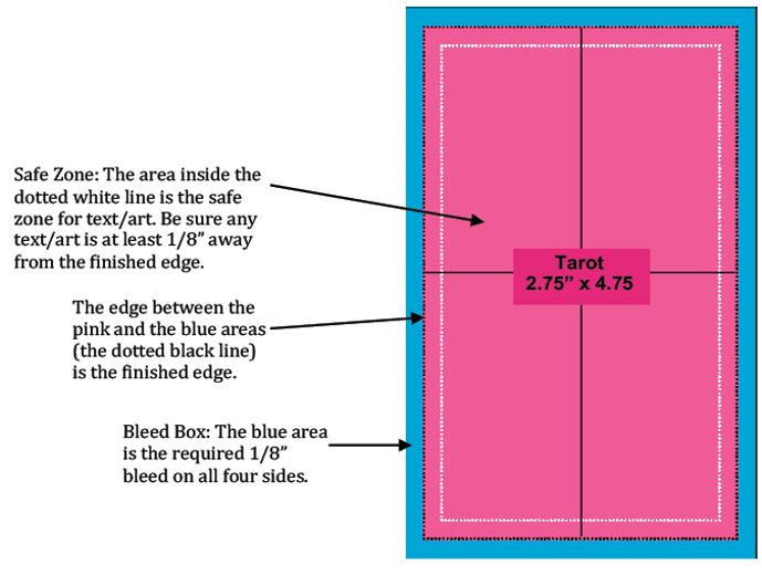
- Bleed is artwork that extends beyond the intended cut edge. It provides additional printed image around the card so a full-bleed background can still reach the edge after cutting.
- Trim is the line where the card is intended to be cut to its finished dimensions.
- Safe area is the protected region inside the trim line where critical text, symbols, faces, and deliberate borders should remain.
Do not use the manufacturer’s bleed as a template and copy the measurement from another printer, as it is not the bleed that the manufacturer has defined. Colors, textures, and images on the background that should extend to the edge of the card should be extended throughout the bleeds. Please do not add a white margin to the canvas.
Maintain card names, card numbers, suit symbols, captions, and other important information within the safe area. Another decorative element to be wary of is what happens if the distance from a decorative element to the trim line changes even slightly. If the same trim line is applied around the entire deck, you will observe this change. Conduct a review of the border space on all sides and on multiple cards, not just one representative design.
Establish these limits before final positioning. Bleed added to the end of the composition may require the background to be stretched, or the image content or critical elements moved at the end of the process.
3. Check Resolution and Color Mode
Resolution will be judged at the final size of the artwork. Even if the image is large, it may not be good for enlarging if the image is enlarged significantly in the card template. Examine every scaled image, whether linked or embedded, such as textures, drawings, and small decorative items.
Request the manufacturer to provide a written response to the resolution required and the acceptable production formats. Don’t assume that a file is a “high-resolution PDF” just because that’s the term used in its description.
Your preflight should also confirm:
- The document uses the manufacturer’s required color workflow.
- Linked images are embedded or packaged as instructed.
- Fonts are embedded, outlined, or otherwise supplied in the required form.
- Transparency and blending effects render correctly in the exported file.
- Hidden drafts, unused layers, notes, and template instructions are excluded from printable artwork.
- Each exported page retains the correct dimensions and orientation.
RGB is created for use on illuminated screens and is not a direct print equivalent of RGB. EZRA Card’s published guidance lists the printing process as CMYK and advises either designing in CMYK or checking and tweaking designs after conversion. The actual export settings should be determined by the manufacturer’s instructions that are selected.
Have an editable master file and a tarot card print file. When problems are detected during prepress, the editable version will allow you to rectify any text, color, image placement, or finish masks without having to rebuild the card again.
4. Organize Card Fronts and Backs
A tarot deck is a collection of related image files, not a collection of unrelated images. When submitting, make sure you have created a manifest document that shows the number of cards you intended to submit and the number of cards you received.
Avoid naming files and/or using PDF page order that can’t be mistaken for anything else. A good naming convention could be: 01-The-Fool-front-v3; the version identifier could be changed if the card is significantly updated. It’s not so much the actual convention; it’s being consistent with it.
The manifest should identify:
- Every unique card front
- The back assigned to each front
- Any alternate or variable backs
- Card orientation
- Version or revision date
- Reference cards, title cards, or other nonstandard additions
Inspect the file set for missing, duplicate, obsolete, and unsorted files. When the manufacturer requires the front and back to be sent as 2 separate multipage files, check to ensure that the pages are ordered as per their pairing guide. When individual files are needed, use the filenames and manifest to indicate the relationship.
Be sure to check for asymmetrical backs. Establish what the top edge is and if it is consistent with all the fronts. This will stop a correctly turned face-up card being matched with a wrongly turned face-down card.
5. Separate Every Special-Finish File
A production mask is an additional file or layer of vectors to specify the exact printing location of a non-CMYK process. It’s a guideline for production, not a representation of what it will look like.
When preparing artwork for masks, be sure to consider the options for card finishing since this will dictate what art is separated off the base design.
If the foil, Spot UV, embossing, and debossing are to be supported (as they are), make an aligned vector layer for each effect and name it clearly with a spot-color name. Do not apply gradients, transparency, shadows, or raster effects to these layers, unless the manufacturer has stipulated otherwise.
If the product mask is not made of metal, and is not a metallic-looking gradient in the composite artwork, then a metallic stamping pattern isn’t possible. A spot UV mask also marks the area for which the gloss contrast is to be applied as opposed to the metallic color. The process pages that are linked to each other help determine what the visual treatment is supposed to be for the mask.
Process-specific relationships between the base artwork, substrate, white layer, and visible effect may be included in white ink and holographic constructions. Confirm the manufacturer’s layer naming, knockout rule, overprint rule, and export rule before finalizing these files.
Provide a low-resolution reference mockup of what you want to see, but not a production artwork. Immediately, the manufacturer must be able to recognize the printable composite, each process mask, and the visual reference.
6. Prepare the Box and Guidebook Separately
The structures of cards, packaging, and printed literature are different and should be sent as separate file groups.
Tuck box to be built on its own approved dieline. Identify which are the front, back, sides, top, bottom, and glue area. Carefully ensure the orientation of the panels is correct, as they may look rotated when they are adjacent on a flat template. Do not alter required production marks or nonprintable areas as directed, and provide separate packaging masking for any special finishes.
The guidebook needs its own document setup. Confirm:
- Finished page dimensions
- Total page count
- Page order
- Cover and interior file arrangement
- Binding and spine requirements, where applicable
- Bleed and safe areas
- Color and export settings
Try not to put boxes and/or guidebook pages in the card-face file to hold the project together. Use a clear folder structure with the master manifest at the top level, and then the Cards, Box, Guidebook, Finish-Masks, and References folders.
7. Do Not Approve Color From a Screen
RGB light is displayed on a monitor, but printed cards require inks, material, and a specific surface treatment. This is even so with a well-prepared digital mockup, which is not a physical color standard.
Look at the transformed drawing for color differences, contrast, shadow detail, and saturation. Highlight in the project notes the color-critical elements such as repeated items in the background, brand colors, skin tones, fine dark details, and cards that need to appear uniform as a set.
However, simulations of the metallic foil, gloss, matte, or soft-touch effect are even more restricted, as they are unable to simulate the response of a physically real surface to light and touch.Digital mockupss are intended to verify placement and design intent, and not to finalize placement and color/finish.
8. Make the Physical Proof an Approval Gate
A proof is a representation of a pre-production file or physical output that is used to review a file or physical output before authorizing the main run. Proofing is not a final ritual but an opportunity to make a decision.
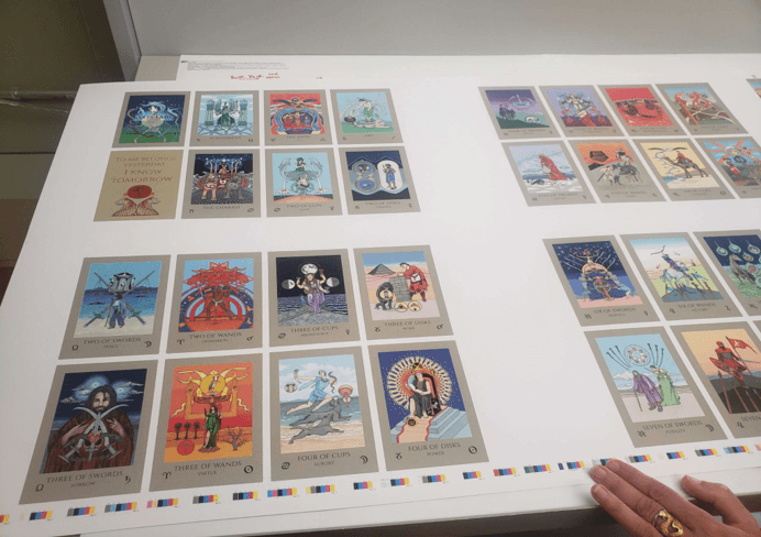
On the physical proof, check:
- Every expected card is present and paired with the correct back.
- Orientation and page order match the manifest.
- Full-bleed artwork reaches the edges as intended.
- Text, symbols, and deliberate borders remain appropriately positioned.
- Small type and fine details are readable.
- Color direction is acceptable under relevant viewing conditions.
- Special-finish placement agrees with the approved masks.
- Box panels have the correct artwork and orientation.
- Guidebook content, page sequence, and covers are correct.
Screenmockupss are of limited use for assessing card material and finishes like foil, UV, matte, gloss, soft touch, etc. The custom sample pack from EZRA Card fits perfectly for comparing any physical materials and/or finishing references before making the decision.
Correct documents by file, component, and version. Any changes to the print artwork, the position of the finish, trim relationships, packaging, or page order should be returned to the proofing workflow before production approval. EZRA Card’s published quality assurance process also provides buyers with questions to ask regarding the inspection points, approvals, and reconciliation of production versions.
9. Send a Complete Production Package
The manufacturer should not be required to deduce the deck’s structure from various attachments. When creating your own tarot deck, please provide a brief specification sheet, organized artwork, and a manifest detailing which files correspond to each physical component.
| Package item | Information to include |
| Project specification | Finished dimensions, card count, front-and-back structure, quantity, destination, and required timing |
| Card artwork | Final or representative fronts and backs in the requested format and order |
| Card manifest | Card names, filenames or page numbers, back assignment, orientation, and version |
| Material direction | Preferred stock characteristics, coating, and handling goals |
| Finish instructions | Selected finishes, placement notes, and separately named production masks |
| Packaging | Box type, approved dieline artwork, panel orientation, and packaging finishes. |
| Guidebook | Finished format, page count, binding direction, cover, interiors, and page order |
| References | Clearly labeled mockups, color references, and notes explaining intended appearance |
| File control | Revision date, version identifier, and one named contact for technical questions |
If the artwork is representative and demonstrates the level of complexity of the project, it may be enough for the initial quote. Indicate if they are examples or final production artwork. Add quantity and delivery destination, as this is not just about the production, and logistics can’t be judged from the illustrations.
EZRA Card advises against releasing files that do not follow its setup guidance. Creators ready to share dimensions, card count, materials, finishes, packaging, quantity, and delivery requirements can request a custom card quote and use the package above to make the inquiry specific enough for technical review.
What paper should tarot cards be printed on?
The best stock for each deck depends on the specific deck. Assess the fundamental, thickness, coating, body finish, and manipulation of the stock to correspond with the finished size and purpose of the card. Physical samples are better than descriptions or screen images as they allow you to see the actual surface treatment and material, prior to approval.
Can I print tarot cards at home?
A home-printed prototype may assist you in inspecting the legibility of the text, consistency of your borders, consistency of your card scale, and orientation. It is not intended to be used as a representation of the color, cutting, card material, special finishes, or packaging in a commercial run. Its use is as an editorial and dimensional check, followed by checking the manufacturer’s proof for production approval.
Popular on OTW Right Now!



About The Author

Christie
I am a content writer with a passion for creating informative, engaging, and easy-to-understand content. I enjoy researching a wide range of topics and sharing insights that help readers learn, make informed decisions, and stay updated on subjects that matter to them.