8 Ecommerce Website Features That Actually Matter for Craft and Fabric Stores
Every few months, another article publishes the same list: mobile optimization, fast checkout, AI-powered recommendations, trust badges. The list is fine. It’s also written for a store selling phone cases or candles — products a buyer can fully understand from a thumbnail.
Fabric stores are different. Craft supplies are different. You’re asking someone to commit to a material they cannot touch, in a quantity they have to estimate, for a project that hasn’t been made yet. That creates a specific set of friction points that generic ecommerce advice never quite addresses.
These eight features are the ones that actually move the needle for craft and fabric retailers — not because they’re trendy, but because they solve the real problem: closing the gap between a screen and a spool.
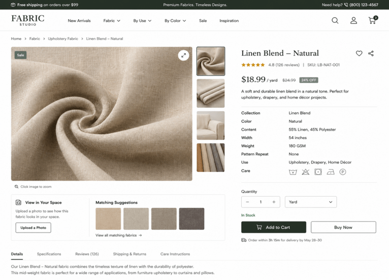
1. High-Fidelity Zoom and Multi-Angle Product Images
For most product categories, a clean hero shot is enough. For fabric, it’s the beginning of a longer conversation.
Buyers need to see texture. They need to see how a knit loops, whether a weave sits flat or has depth, and how the sheen on a satin behaves in different lighting. A single flat-lay image doesn’t answer any of those questions. What works:
- Macro zoom on texture — close enough to see individual fibers or the weave structure
- Multiple lighting conditions — especially for shiny or iridescent materials
- Draped shots — fabric hanging or folded, showing weight and drape behavior
- Scale reference — a hand, a ruler, or a garment alongside the fabric
The goal isn’t aesthetics. It’s giving the buyer the visual information that replaces touching the bolt.
2. Per-Yard (or Per-Meter) Purchasing with Flexible Quantity
Forcing craft buyers to purchase in fixed bundles — a minimum of 3 yards, a pre-packaged bolt — creates immediate friction. A quilter making a wall hanging needs 1.5 yards. A dressmaker working on a single project doesn’t want to guess whether 5 yards is enough and risk running short, or order 10 and waste the rest.
The ability to enter a custom yardage amount, see the price update in real time, and add exactly what’s needed removes one of the biggest pre-purchase hesitations in the category.
Stores that let buyers order fabric by the yard rather than in fixed increments reduce one of the clearest category-specific friction points: the purchase feels tied to the buyer’s actual project, not to a preset bundle.
If your platform allows it, a minimum-quantity indicator (“sold in increments of 0.5 yards”) further reduces confusion at checkout.
3. Detailed Spec Panels on Every Product Page
Three numbers determine whether a fabric buyer clicks “add to cart” or bounces to a competitor:
| Spec | Why It Matters | Typical Range |
| Weight (GSM) | Tells the buyer how substantial the fabric feels — lightweight for floaty dresses, heavier for outerwear | 80 GSM (sheer) → 400+ GSM (canvas, denim) |
| Stretch % | Critical for fitted garments; a buyer making leggings needs to know the stretch in both directions | 0% (woven) → 100%+ (performance knits) |
| Fiber Content | Affects wash care, breathability, skin sensitivity, and sustainability preferences | e.g. 95% cotton / 5% elastane |
Craft buyers who have experience in the craft industry tend to skim-read this information before reading the product description. If it’s not found or within a tab, they walk away. Place the spec panel above the fold, close to the price and quantity selector.
For knit fabrics in particular — stretchy knit fabric like rib knit, for example — stretch percentage is often the deciding factor between a fabric that works for a fitted garment and one that doesn’t. Listing it clearly removes a question that would otherwise require a customer service email.
4. Filter by Use Case, Not Just Fabric Name
There are more than a few people out there who start shopping crafty by picking a material name. They start with a project.
“Fabric for leggings.” How would you like to be dressed in a summer dress? I need an item to wear with a lined coat. Here are the actual search terms – and if you just have categories of material, such as Cotton, Polyester, Linen, then you are making your buyers do all the work.
Application-based or use-case-based filtering solves this:
- Shop by project type (activewear, bridal, home décor, bags)
- Filter by function (stretchy, moisture-wicking, waterproof)
- Filter by weight range (lightweight, medium, heavy)
This is not a substitute for browsing using material; it’s in addition. For those who know they are looking for linen, it is available. If you’re aware you’re purchasing a summer blouse, you can narrow down your search to what works, and then choose the fabric.
The outcome: less effort required to find a relevant product, less bounce rate, and customers feeling like the site understands them and how they shop.
5. Sample or Swatch Order Options
Not all buyers are willing to take the plunge on a fabric that they have never felt before. The most significant obstacle to making a first purchase from a new customer is eliminated when a swatch or sample order is offered, and the small cost of taking the order is minimal.
The idea of conversion is simple: If a buyer orders a swatch and likes it, he or she returns the entire sum. If the buyer has no swatch option, then they must take a chance whether or not they take the order (and may cancel), or purchase from another vendor that does provide one.
Even if your platform doesn’t have the option of sample ordering, a sample product listing for each material — or a flat-rate sample package — will have the same effect. Though the initial psychological investment in a commitment to purchasing it as a full cut of fabric is lowered significantly if it is provided as a sample.
6. Customer Project Photos Alongside Studio Images
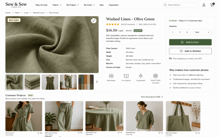
The fabric is displayed in studio photography. Customers’ pictures depict the fabric’s transformation.
If a person is considering the purchase of a jersey knit for a skirt that will be used to flow, he or she will be better served by seeing a photo of a customer’s completed piece than reading a description of the product. The same goes for color accuracy; a customer shot in natural light in a real room will provide a more accurate color reference than a controlled studio shot.
Collecting these photos doesn’t require a complex system:
- A post-purchase follow-up email asking buyers to share finished project photos
- A branded hashtag on Instagram or TikTok with permission to repost
- A small incentive — store credit or a discount — for submitted photos used in listings
Use them directly on the product page, after the studio pictures. This is a great combination of social proof and useful buying information.
7. A Returns and Fulfillment Policy Written for Fabric Buyers
Return policies are generic, and they cause particular anxiety for craft buyers, who have come across return policies before and found them to be a disappointment.
There is one big reason why some people hesitate to use cut-to-order fabric for their projects: a lot of stores handle cut-to-order fabric differently than they do with those that are on the shelf. If you have a fabric on your yard shop and cut every order when you place it, the policy should be communicated clearly at the time of checkout. However, if customers aren’t explicitly told this on the product page, they take it for granted that they can return it and are then turned into angry customers, or they assume they can’t return it and decide they don’t want to purchase it.
A fabric-specific policy page — linked from every product page — should address:
- Whether cut fabric can be returned, and under what conditions (wrong item, defect, vs. buyer’s remorse)
- How color variation is handled (screen calibration, dye lot differences)
- Processing times for cut-to-order items versus stocked items
- Whether remnants or shortcuts are available at a discount
Clear policy language reduces customer service volume and increases purchase confidence — two outcomes that rarely come from the same source.
8. Mobile-First Product Pages That Don’t Compress the Details
Craft buyers are constantly surfing around on mobile, on the sofa with a half-finished project open, whilst on the way to the fabric shop to see pricing comparisons, or on lunch break with a pattern open in another tab. The only category of the site that has a specific issue with mobile is the craft category – the information that really matters for the purchase (GSM, stretch %, fiber content, texture zoom) is the very thing that gets squashed or hidden in the collapsed accordion menus on poorly optimized mobile layouts.
Mobile-first for a fabric store means:
- Spec panels visible without expanding a tab — or with a single tap, not buried
- Zoom functionality that works on touch screens, not just desktop hover
- Quantity selector that’s easy to adjust without accidentally triggering the wrong value
- Product images that load at full resolution on mobile, not compressed thumbnails
It’s not simply about responsive design. This is a mobile experience without losing the information, which enables fabric to make buying decisions.
The Common Thread
All these features are related to the same issue, that is, fabric is a tactile product that is sold from a flat screen. Those stores that convert well aren’t the ones that have a super advanced tech stack; they’re the ones that have seriously considered what information a consumer needs before entrusting an online purchase of something they can’t touch.
But find out that, and many of the usual e-commerce tips will take care of themselves.
Popular on OTW Right Now!


About The Author
Gagan Bhangu
Founder of otechworld.com and managing editor. He is a tech geek, web-developer, and blogger. He holds a master's degree in computer applications and making money online since 2015.